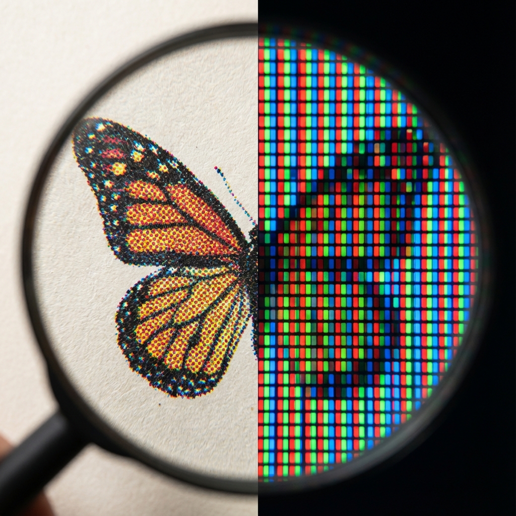
You designed a beautiful business card. On the screen, the colors are vibrant, neon, almost "glowing." You pick up the print from the print shop and... confusion. Instead of juicy lime, you have a muted green, and the sky blue has turned gray. Did the print shop make a mistake? Not necessarily. It's the classic conflict of two worlds: RGB and CMYK.
Two Color Languages: Light vs Ink
To understand this issue, we need to realize one fundamental difference. Your monitor emits light, while paper reflects it.
RGB – The Language of Screens (Red, Green, Blue)
Your monitor, smartphone, or TV creates an image by adding light. By mixing red, green, and blue at 100% intensity, we get white light. This is called additive synthesis. Screens can display millions of vibrant, bright colors, including bright neons that... cannot physically be printed with standard inks.
CMYK – The Language of Print (Cyan, Magenta, Yellow, Key/Black)
The print shop does not paint with light. We print with inks on paper. Here, subtractive synthesis works – inks absorb light. If you mix all CMYK colors, theoretically you get black (in practice, dark brown, which is why we add black ink - K). The CMYK color space is much narrower than RGB.
Expert Tip:
Never judge project colors on a phone in full sunlight or on an uncalibrated office monitor. What you see is a "simulation." If color is crucial for your brand (e.g., in a logo), always order a so-called digital proof (test print) before running the entire print run.
Why Do Colors Change?
Imagine trying to paint a sunset using only school crayons, while you saw the original in 4K quality on a new OLED TV. Some screen colors are simply "out of reach" for printing inks. We call this gamut.
- Blues and Purples: Often lose depth and may turn into a dirty shade.
- Bright Oranges and Greens: In CMYK printing, they will lose their "glowing" intensity.
How to Avoid Disaster? 3 Golden Rules
-
Design in CMYK from the start.
If you use Photoshop, Illustrator, or InDesign, set the color mode to CMYK right from the start. This way, you won't "fool the eye" with colors that can't be printed. -
Convert wisely.
If you have a finished project in RGB, convert it to a CMYK profile (the standard in Europe is often Coated FOGRA39). You will then see how the colors "fade" – you can manually enhance them instead of relying on automation. -
Trust black.
Text (especially small) should always be 100% K (black), not "rich black" with a mix of other colors, which can cause blurring of letters with minimal machine shift.
Need a professional graphic design?
Fill out the form – we will prepare an innovative project for your company that will make you stand out in the market.
Order a project